Key Takeaways
- What seems to have happened: In 1513, Ottoman admiral Piri Reis compiled a world chart from more than twenty earlier maps, including one from Christopher Columbus. A fragment of this chart was rediscovered in 1929 at the Topkapı Palace library, showing Atlantic coasts and a mysterious southern landmass open to interpretation.
- What the evidence supports: Institutional analyses from UNESCO, the Library of Congress, and scholars like Gregory McIntosh view it as a sophisticated portolan compilation. Conventional explanations—distorted projections, Terra Australis traditions, and copying errors—better account for the southern outline than extraordinary theories.
- What remains unresolved: The exact sources and origins of many charts Piri used are lost to time. Projection choices fuel debates, and ideas like Hapgood’s Antarctic overlays persist in public discussions despite scholarly pushback.
A Fragment That Whispers of Lost Shores
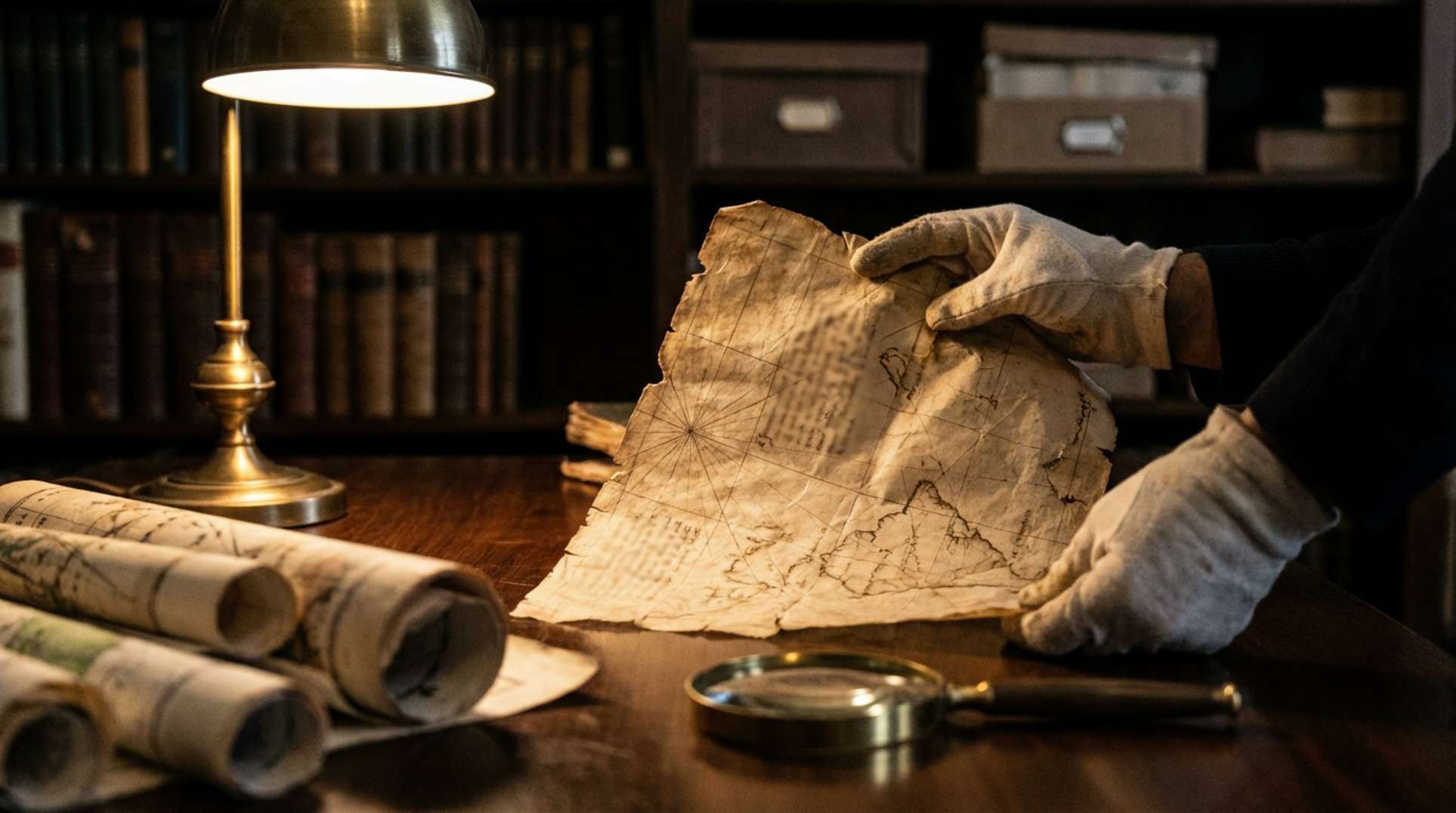
Picture the dim halls of Istanbul’s Topkapı Palace in late 1929. Scholars sift through forgotten stacks, cataloging the remnants of an empire. One pulls out a weathered sheet of parchment, its inks faded but alive with rhumb lines and coastal curves. This is no ordinary relic—it’s a piece of a map from 1513, drawn by Ottoman admiral Piri Reis amid the churn of Mediterranean seas and the Age of Discovery.
Flash back to that era: sails snap in the wind, explorers chase horizons, and knowledge flows from captured charts and whispered reports. The surviving fragment, roughly one-third of the original, measures about 87 by 63 centimeters. It’s a portolan chart, practical for navigators yet adorned with notes and details that hint at broader worlds.
What Witnesses and Analysts Report
In alternative research circles, the map sparks intense discussion. Many see the southern landmass as evidence of an ice-free Antarctica, perhaps mapped by ancient civilizations or with outside help. These interpretations point to contours that seem to match subglacial bedrock, far beyond what 16th-century sailors should have known.
Charles Hapgood brought this to wider attention in his 1966 book, Maps of the Ancient Sea Kings, arguing for lost knowledge preserved in the chart. Figures like Graham Hancock have built on it, fueling documentaries and online videos. Community members share digital overlays, re-projections, and forum debates, highlighting selective matches to modern surveys.
Historians and independent investigators offer varied takes. Some note Hapgood’s claimed correspondence with Air Force cartographers, discussing resemblances to seismic data—these letters remain a point of contention. Witnesses in the field argue the map compiles forgotten voyages, while analysts stress the need to respect all perspectives without quick dismissal.
Timelines, Tracks, and Hard Data
The facts anchor this story. Piri Reis inscribed the map in 1513, compiling it from over twenty sources, including a chart from Columbus. Rediscovered in 1929 during cataloging at Topkapı Palace by scholars like Gustav Adolf Deissmann, the fragment now resides there, recognized by UNESCO as a key Ottoman artifact.
It’s a portolan-style chart with rhumb lines and marginal notes, emphasizing coasts. Gregory McIntosh’s 2000 analysis underscores its compilation from earlier works. Hapgood’s 1966 book pushed alternative views, referencing mid-20th-century Antarctic surveys like the NBSAE from 1949–1952, though mainstream sources question those links.
| Key Data Point | Details |
|---|---|
| Map Date | 1513 AD (Piri Reis inscription) |
| Rediscovery | 1929 at Topkapı Palace |
| Dimensions | ~87 x 63 cm |
| Surviving Fraction | Roughly one-third |
| Claimed Sources | More than twenty charts, including Columbus |
| Hapgood Book | 1966 |
| Antarctic Survey | NBSAE, 1949–1952 |
Official Story vs. What the Data Suggests
Institutions like UNESCO and the Library of Congress describe the map as a 1513 Ottoman work drawing from Mediterranean and Atlantic sources. Academic cartographers, including McIntosh, attribute the southern landmass to projection distortions, traditional Terra Australis depictions, and errors in copying—straightforward reasons grounded in historical mapping practices.
Geophysicists add that paleoclimate data rules out an ice-free Antarctica in recent prehistory, rejecting Hapgood’s crustal displacement theory. Yet community interpretations diverge, using overlays that align features persuasively but risk bias in projection choices and scale.
Both sides agree on the map’s value as an early compilation of global knowledge. The tension lies in anomalies: where officials see convention, researchers spot patterns hinting at more. Methods matter—overlays can mislead if not rigorous, but they keep the debate alive.
What It All Might Mean
The core holds firm: Piri Reis crafted a remarkable 1513 chart from diverse, now-lost sources. Scholarship leans toward everyday cartographic quirks explaining the oddities, not ancient secrets.
Questions linger. What were those exact source maps? How much stems from projection versus error? Might lost Iberian charts hold unexpected details? And do seismic profile matches stand up under strict testing?
This resonates because it’s fragmentary, inviting imagination. It bridges verified history and the unknown, drawing those who question official lines. Dig deeper: hunt archives for source clues, run transparent projections, talk to historians and proponents. The patterns might reveal more than we think.
Frequently Asked Questions
The Piri Reis map is a 1513 Ottoman chart compiled by admiral Piri Reis from over twenty sources, including one from Columbus. Only a fragment survives, showing Atlantic coasts and a southern landmass that sparks debate.
Alternative researchers like Charles Hapgood argue it depicts an ice-free Antarctic coastline, using overlays to match modern surveys. Mainstream scholars explain it through conventional cartographic errors and projections, not extraordinary knowledge.
UNESCO and the Library of Congress treat it as a sophisticated 1513 compilation from earlier charts. They favor explanations like distorted projections and Terra Australis traditions over claims of lost civilizations.
Its fragmentary nature and anomalies invite interpretation, fueling discussions between official views and alternative theories. Open questions about sources and projections keep curiosity alive in communities tracking unexplained history.
Proponents use digital overlays and re-projections to align the southern landmass with Antarctic features, referencing Hapgood’s book and claimed Air Force correspondence. These methods show visual matches but face criticism for potential bias.


