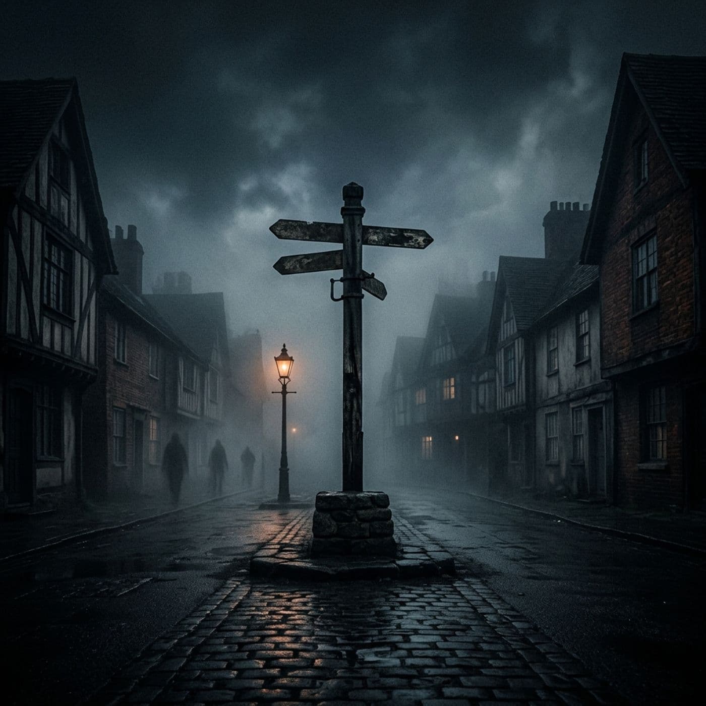
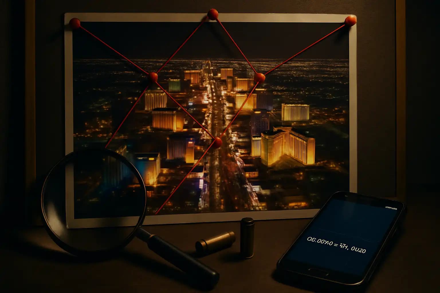

1. The Map in Question
Authorities released a detailed diagram shortly after the attack, showing every round fired from the 32nd-floor window of Mandalay Bay to the Route 91 Harvest Festival. The map illustrates bullets arcing in a perfect forty-five-degree fan, with impact points clustering uniformly. Crime-scene diagrams simplify chaos, but seasoned investigators observed an unusual precision: no ricochet arrows, no data gaps, and no alternate firing positions. Overlay that official sheet on satellite imagery, and certain angles clearly intersect concession tents that witnesses claim were untouched. This mismatch raises questions no press conference has answered.
2. GPS Drift or Data Drift?
Smartphones in the crowd captured timestamps and coordinates, yet several clips place impact flashes closer to Las Vegas Boulevard than the map indicates. Consumer GPS can drift ten meters on a bad night, especially beneath high-rise glare. Nonetheless, cross-referencing three devices reveals a consistent northward offset of roughly eleven meters. Explore the raw metadata yourself; independent GPS audits highlight clusters ignored by the official narrative.
3. Line of Sight Calculations
Ballistic experts calculated the hotel’s height, bullet velocity, and stage location. They identified blind zones—areas where lighting rigs and vendor trailers block direct shots. Yet witnesses in those zones report injuries. A retired engineer created a 3-D model that conflicts with street-level imagery, citing discrepancies of up to seven degrees in elevation. His file circulated forums and resurfaced in line-of-sight discussions. If obstacles shielded parts of the venue, how did projectiles still strike?
4. The Moving Shooter Hypothesis
The map confines gunfire to a single position, prompting critics to argue it ignores evidence of secondary locations. Police audio at 10:12 p.m. refers to shots “coming from the Luxor side.” Officers dismissed this as echo, but forensic mic arrays—designed to triangulate muzzle blasts—record minute timing differences. A two-millisecond delay can shift the origin by several blocks. The official release failed to graph those acoustic vectors, and requests for raw data stall in bureaucratic loops echoing dystopian manuals.
5. Algorithmic Blind Spots
Modern mapping relies on machine-learning smoothing. Erratic data can result in algorithms filtering out anomalies that hint at complexity. If investigators train software on range-practice tables, outliers—such as a low-angle shot fired at street level—might disappear. The sanitized schematic then permeates media, embedding public memory before human auditors can verify it. This pattern mirrors how autopilot systems concealed sensor faults until disasters occurred, as detailed in engineering digests.
6. Missing Camera Frames, Missing Map Layers
Casinos possess enough HD surveillance to reconstruct a gambler’s blunder, yet critical hallway footage arrives with gaps. Key frames disappear as the gunman wheels luggage past an emergency door. The map’s timeline fills these blank minutes with straight arrows from elevator to suite, evading the mystery of why other corridors reveal no evidence. For comparison, maritime investigators faced similar data voids, documented in an unrelated report found among nautical archives, where missing AIS pings distorted voyage tracks.
7. Crowd Flow vs. Impact Clusters
Eyewitnesses fled south toward Giles Street. However, the map’s body markers cluster closer to the main stage—where some evacuees insist they had already left before the heaviest fire. Forensic anthropologists matched trauma timing to paramedic radio logs, revealing delays that suggest bullets struck later than indicated. If you believe chaos muddles memory, remember that marathon investigators use similar timing correlations to pinpoint detonations precisely. Disparities that linger after large-sample averaging warrant scrutiny.
8. The Helicopter Rumor Loop
No tragedy escapes airborne conspiracy. Speculation about helicopters firing into the crowd surged on fringe boards, citing flashing muzzles above the strip. FAA radar logs indicate normal tourist traffic, but a private hangar appears in a pilot’s canceled IFR plan minutes after the shots began. The map completely excludes any aerial trajectory. While evidence supports ground-based fire, investigators must maintain transparency. Recall that military analysts dismissed automated retaliation systems until leaked documents emerged decades later, as outlined in archival investigations.
9. Why the Diagram Matters Beyond Vegas
Maps shape memory. Drawing a line incorrectly today can lead to its publication in textbooks tomorrow. When official graphics ignore witness contradictions, the divide between public trust and government briefings widens. This dynamic sparks social volatility, similar to what geopolitical strategists observe in Indo-Pacific flashpoints summarized at foreign-policy trackers. A flawed map from Nevada reinforces cynicism worldwide.
10. Remedies: Open Audit Culture
Pediatric hospitals publish error statistics; airline regulators share incident tapes. Mass-casualty investigations deserve equal transparency. Real reform should include:
- Public release of raw ballistic trajectories with coordinate uncertainties.
- Open-source 3-D scene files for independent verification.
- A crowd-sourced registry of video timestamps similar to earthquake shake maps.
Until then, the void invites rumor, and rumor festers.
11. What the Experts Really Disagree On
Skeptics and officials agree on physics—bullets travel in parabolic arcs, not zigzags. They disagree on initial conditions: muzzle height, barrel direction, and wind deflection. Minor shifts in those inputs create wildly different impact plots, a sensitivity shared by chaotic systems, akin to outer-space debris fields analyzed at Wikipedia’s technical appendix. Whether investigator bias or software smoothing affected the numbers, the public sees endpoints—not the probability clouds that underlie them.
12. Staying Sane in the Conspiracy Age
Healthy skepticism promotes honesty; pathological distrust disintegrates societies. Verify claims against primary data; trace diagrams to raw feeds. If agencies stall, file FOIAs instead of sending incendiary tweets. Diversify your sources—one outlet, one algorithmic feed, or one map cannot reveal the entire truth. Aggregators at Unexplained.co compile overlooked leaks, yet they also urge cross-checking.
13. Final Word: Maps Are Stories We Draw
Cartographers once sketched dragons over blank waters; modern officials depict certainty over chaotic tragedies. The Las Vegas shooting map may accurately outline events but misrepresents details—like a weather forecast that predicts sunrise yet overlooks a tornado. If auditors force data back into daylight, lines of fire could shift, altering our understanding of failures and their causes. Until then, the suspicious map of Las Vegas stands as a cautionary tableau: trust, but measure the angle yourself.